1
Dec
Welcome to Different by Design
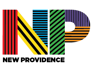
Original logo choice
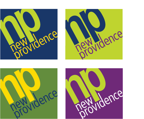
Final logo choice
Why Is Branding
So Hard
I am sure most designers will agree that designing something like a website or a promotional piece for your own company can be a most painful process. Branding is ongoing and really never ends. It just keeps evolving and changing.
First you think you’ve got it, and then it slips through your fingers. This past year I designed a new logo for the small town that I live in, New Providence, New Jersey. In some ways it was fraught with the same issues that arise when designing something for your own company. Something like the “too close to home ” idea.
The process took the better part of a year. We had many meetings, and when I thought we had a logo to work with, the committee decided that we needed to start over. At first I was disappointed, not just because I had to start from scratch, but because I really loved the logo and all the possibilities it brought to the table for branding. It was hip and fun and colorful. It projected diversity and many of the nice things about living here, without illustration, just type.
Back to the drawing board, and here is what we eventually agreed on, pictured also at the left under the original design choice. In all honesty I think the actual choice is better for so many reasons. It is clearer, cleaner and easier to work with and has the same punch as the original logo. It is also more sophisticated which in the long run works better for the town.