This branding project has special meaning for me since I have lived in New Providence for over 25 years. The assignment was to brand our small town with a clean and clear message. New Providence has changed immensely, and I was in a unique position to evaluate what the town would need to update the look and feel. I participated in many meetings with town officials from the borough administrator to the public information officer and members of the business community. The result is a logo which is bursting out of its own demarcation and also on an angle to give it a more off-center feel. It is quirky and fun, yet still somewhat traditional.
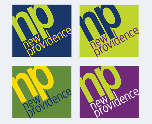
New Providence’s colors have been evergreen and gold for many years. The color schemes are new and fresh with a lime green and a brighter yellow with the addition of navy blue, purple and a medium green.
We decided that it would be nice for the different departments to have variations on the color schemes, hence the 4 logos shown. The administrative department will use the navy background. Planning and development will use the lime green background, and public safety will use the medium green background. The recreation department will use the purple background.